Information Visualization as a DevOps Monitoring Tool

PUBLISHED IN
Continuous Deployment of CapabilityFrom the dawn of humanity, people have been trying to represent knowledge visually to communicate ideas to their peers. Yet we still struggle to this day whenever we need to present information in a way that is both simple and effective. In this blog post, the first in a series on Information Visualization in DevOps, I explore how visual graphics can assist in the DevOps process.
The use of abstract graphics to display data is a fairly recent invention, due to the multi-disciplinary aspect of information visualization. This new area requires visual-artistic, statistical-mathematical, and cognitive science skills.
In fact, displaying data as graphics goes beyond aesthetics; it aims to display information in a way that makes use of our cognitive skills to detect patterns in the information displayed. At the very least, graphics are good substitutes for data tables; at their best, they become instruments for reasoning about quantitative information. To interpret graphics, we use our innate human ability to identify trends, outliers, and repetitive or anomalous patterns. This ability comes in handy when we need to quickly look at large amounts of information to gather insights about what is being represented.
How Visuals Can Help the DevOps Process
In industrial environments, there are panels that concentrate information about how each component in the production line is behaving at any time. In the past, those panels contained mechanical gauges, which gave only an instant reading. Today, automated systems with databases can accumulate those readings to display them in real time on the digital equivalent of the older gauges. These dashboards have become a standard across industries to give situational awareness about anything one can imagine. From financial systems to factories, people want to see dashboards because they provide a quick understanding of what is happening within a given system.
DevOps emphasizes the collaboration and communication between software developers and information technology professionals, while automating the process of software delivery and infrastructure changes. If we think about the DevOps lifecycle as a system, it is possible to examine its components and establish metrics that provide situational awareness.
Let's consider the Secure DevOps lifecycle diagram below:
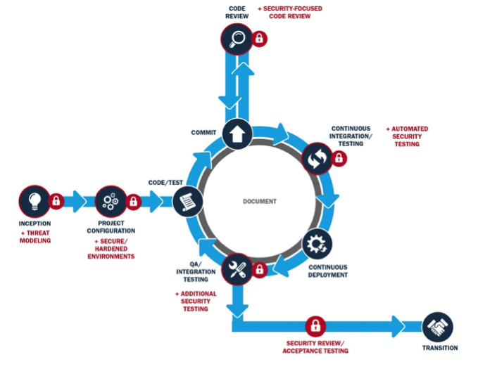
At every stage of the diagram, we can take advantage of the analytical opportunities of that phase to gather meaningful metrics. Here is a list of the different phases and the corresponding metrics that could be monitored throughout the lifecycle:
| Phase | Potential Issues | Useful Metrics |
|---|---|---|
| INCEPTION/PROJECT CONFIGURATION / SECURITY | Scripts that create infrastructure can be exploited opening backdoors | Infrastructure vulnerability reports from automated penetration tests and/or assessments |
| CODE/COMMIT/CI | Organic growth of codebase may add potential risk of failure in software | Changes to the size of the codebase, most active developers, areas of largest growth, sprint sizes, sprint/project completion |
| QA/TESTING | Software does not perform as it should | Number of open/resolved issues per sprint, number of failed unit tests, reports from automated UI testing |
| CONTINUOUS DEPLOYMENT | Software is not performing as it should in network | Software dependency versions, server heartbeat monitoring |
| Daily System Use | System utilization may introduce scalability problems | Data volume reports (used to forecast system expansion), data integrity test results, user base sanity checks |
When planned ahead of the implementation, it is possible to add instrumentation that will allow us to monitor the DevOps process from its early development stage to its full operation in a production environment. The results can then be displayed as visualizations in a dashboard.
Our Next Steps
The goals of this series of posts are to (1) create awareness of the usefulness of information visualization as a means to query data sets or to display data adequately and effectively and (2) demonstrate how to apply those concepts in order to gather insights about different parts of the DevOps process.
In this series, we will explore the cases presented in the above table. We will present concrete examples of how such monitoring can be implemented and how information visualization can help us achieve it.
In the next post, we will implement visualizations to help us monitor the code written for a project and to identify areas of high activity that may introduce potential issues during the software development process.
Bibliography
Additional Resources
To view the webinar DevOps Panel Discussion featuring Kevin Fall, Hasan Yasar, and Joseph D. Yankel, please click here.
To view the webinar Culture Shock: Unlocking DevOps with Collaboration and Communication with Aaron Volkmann and Todd Waits please click here.
To view the webinar What DevOps is Not! with Hasan Yasar and C. Aaron Cois, please click here.
To listen to the podcast DevOps--Transform Development and Operations for Fast, Secure Deployments featuring Gene Kim and Julia Allen, please click here.
To read all of the blog posts in our DevOps series, please click here.
Written By

More By The Author
More In Continuous Deployment of Capability
PUBLISHED IN
Continuous Deployment of CapabilityGet updates on our latest work.
Sign up to have the latest post sent to your inbox weekly.
Subscribe Get our RSS feedMore In Continuous Deployment of Capability
Get updates on our latest work.
Each week, our researchers write about the latest in software engineering, cybersecurity and artificial intelligence. Sign up to get the latest post sent to your inbox the day it's published.
Subscribe Get our RSS feed