Introducing Atlas: A Prototype for Visualizing the Internet

After 30 years, cyber command centers, educators, and Internet threat intelligence organizations have yet to embrace a standardized, encompassing, and intuitive way to represent the entities and activities of the Internet. Such a representation would make the Internet more understandable and allow shared situational awareness of Internet events and activities--the much-sought-after "Cyber Common Operational Picture." This post describes Atlas: a working demonstration application for visualizing the Internet.
What Does the Internet "Look Like?"
Randall Munroe, creator of the webcomic xkcd, proposed a map of the IPv4 address space in 2006:
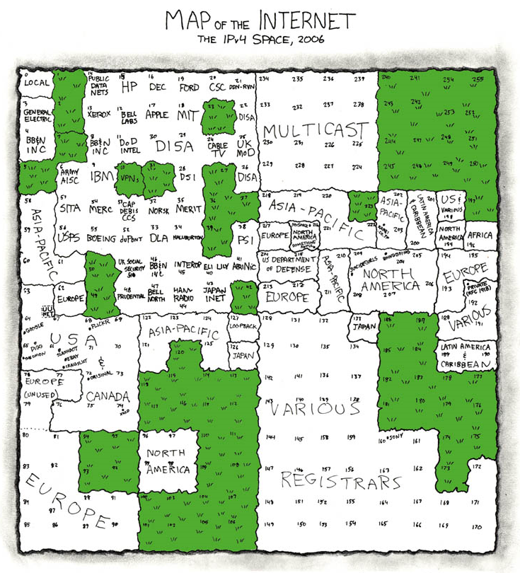
Source: https://xkcd.com/195/ under license CC BY-NC 2.5
He was definitely onto something: a better way to represent the Internet as a graphic. By better, I mean more intuitive than a "squashed bug" depiction, which provides no context:
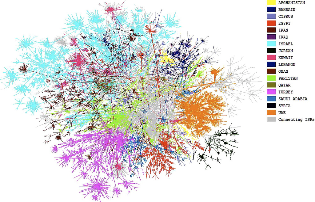
Source: https://blogs.harvard.edu/mesh/2008/09/internet-map-of-the-middle-east/
More relevant than a geographic overlay, which isn't readable at scale, wastes visual real estate showing unpopulated areas (oceans, Antarctica, deserts, etc.), and overvalues the importance of geography relative to the Internet:
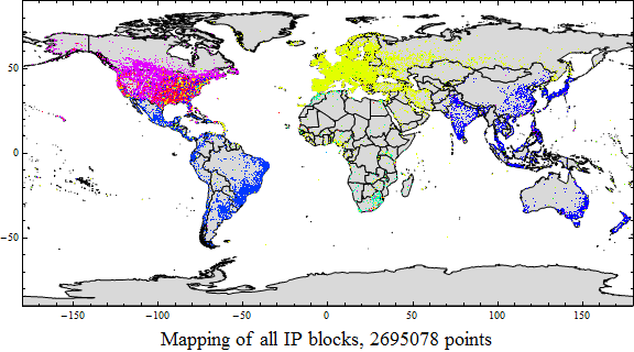
Source: Research Pipeline
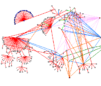
More predictable than a connectivity graph, which redraws continuously as nodes and connections change:
So what attributes of an Internet visualization do I think are ideal?
Intuitive. With limited training and a basic understanding of the Internet, a user should be able to visually identify attributes of individual Internet entities (such as hierarchical relationships, scale, size, distribution, country of ownership, domain, reputation, etc.) using display techniques commonly found in apps and geographic map displays.
Contextual. The display should emphasize concepts most directly related to the Internet, such as IP addressing, network connectivity, and domain membership.
Visually efficient. The display, when viewed at a scale that still allows identification of individual sub-elements, should fit into a reasonable viewing area without including unused space. It should support both a useful global view as well as increasing granularity when exploring individual elements.
Predictable. Entities should consistently be in the same place relative to each other. This greatly improves the ability of a user to visually orient themselves and read the map.
What Do We Have to Work With?
- Countries. Countries are an appropriate level of geographical granularity for Internet situational awareness because country-level legal restrictions and requirements often require commercial and government organizations to try to determine a user's country of origin.
- Autonomous Systems (AS). An Autonomous System is a collection of netblocks managed by a single entity or organization. AS are the highest level building blocks of the Internet.
- Netblocks. Netblocks are the building blocks of AS. Each netblock represents a portion of the Internet usually belonging to a single entity or organization.
- IP addresses. IP addresses belong to netblocks and represent end-point devices, servers, and Internet infrastructure.
- Netblocks. Netblocks are the building blocks of AS. Each netblock represents a portion of the Internet usually belonging to a single entity or organization.
- Autonomous Systems (AS). An Autonomous System is a collection of netblocks managed by a single entity or organization. AS are the highest level building blocks of the Internet.
Given these building blocks, could we build a map of the Internet that predictably and intuitively fixes the location for netblocks, while accounting for AS and countries?
"Really, displaying hundreds of thousands of individual netblocks?" you might ask. "With that number growing significantly each year?"
Well, yes, that is what I'm proposing. There's even an analog: planet Earth.
The National Geospatial Intelligence Agency provides the Digital Terrain and Elevation Data (DTED) datasets. DTED Level 1 provides landform, slope, elevation and/or gross terrain roughness for Earth's land surfaces in 100-square-meter chunks. Imagine a similar dataset for netblocks that includes identifying (ownership) information, the number of assigned IP addresses, services offered, and reputation/history data. If only we could figure out a way to draw the netblock "DTED-like" dataset using a projection that addresses the shortfalls of the other display options we discussed above.
Geographic cartography can help us out. All geographic maps throughout history have made arbitrary decisions about where to begin, what scale to use, what to include and exclude, and how to manage complications. Wikipedia lists dozens of unique map projections that attempt to represent the round Earth on a flat display, each making its own set of trade-offs and arbitrary reference decisions. What if we make a set of similar limiting assumptions about our Internet map?
Introducing Atlas
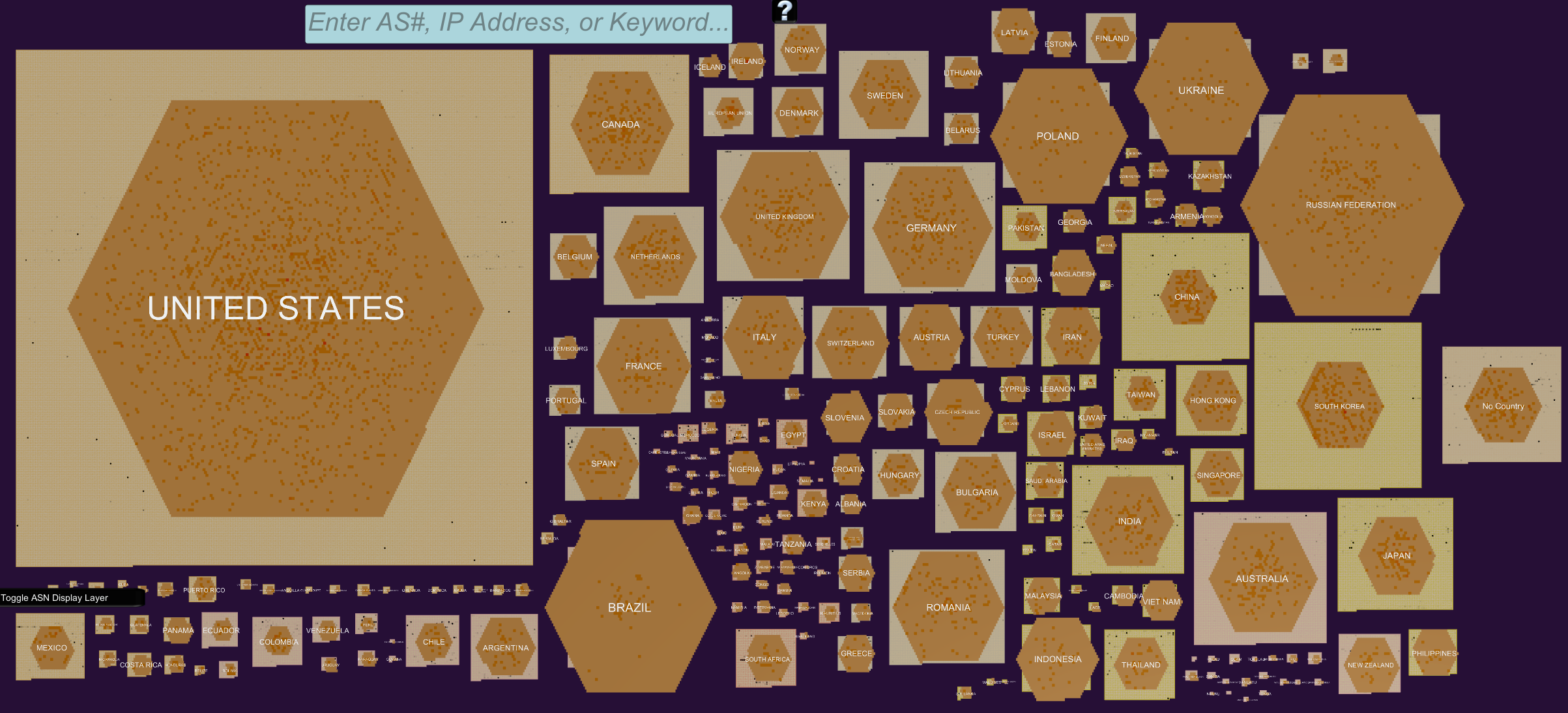
Atlas is an application originally developed by the SEI to display the results of research into Internet reputation, specifically to answer the question, "Can we display where 'bad neighborhoods' are on the Internet?" It was built using a commercial game development engine to explore the advantages and disadvantages of increased display interactivity.
Atlas has implemented two different projections, both based on three key elements: country, AS, and netblock. This blog post will discuss the first Atlas projection, Parallel Planes. I'll discuss the second projection, Pangaea, in a future post.
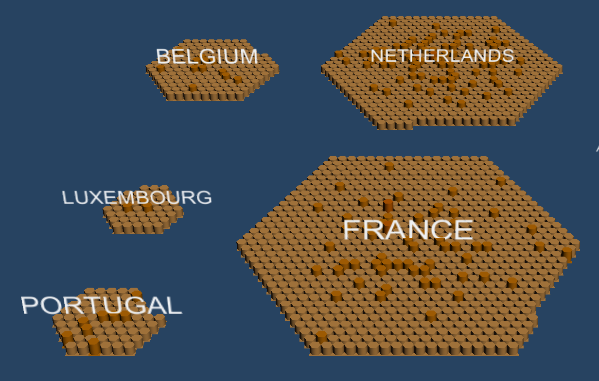
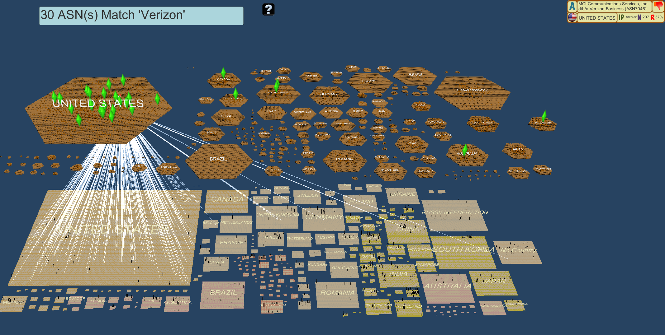
The Parallel Planes projection creates two layered representations, both organized physically by country. The top layer displays ASNs as hexagons, while the bottom layer displays netblocks as squares.
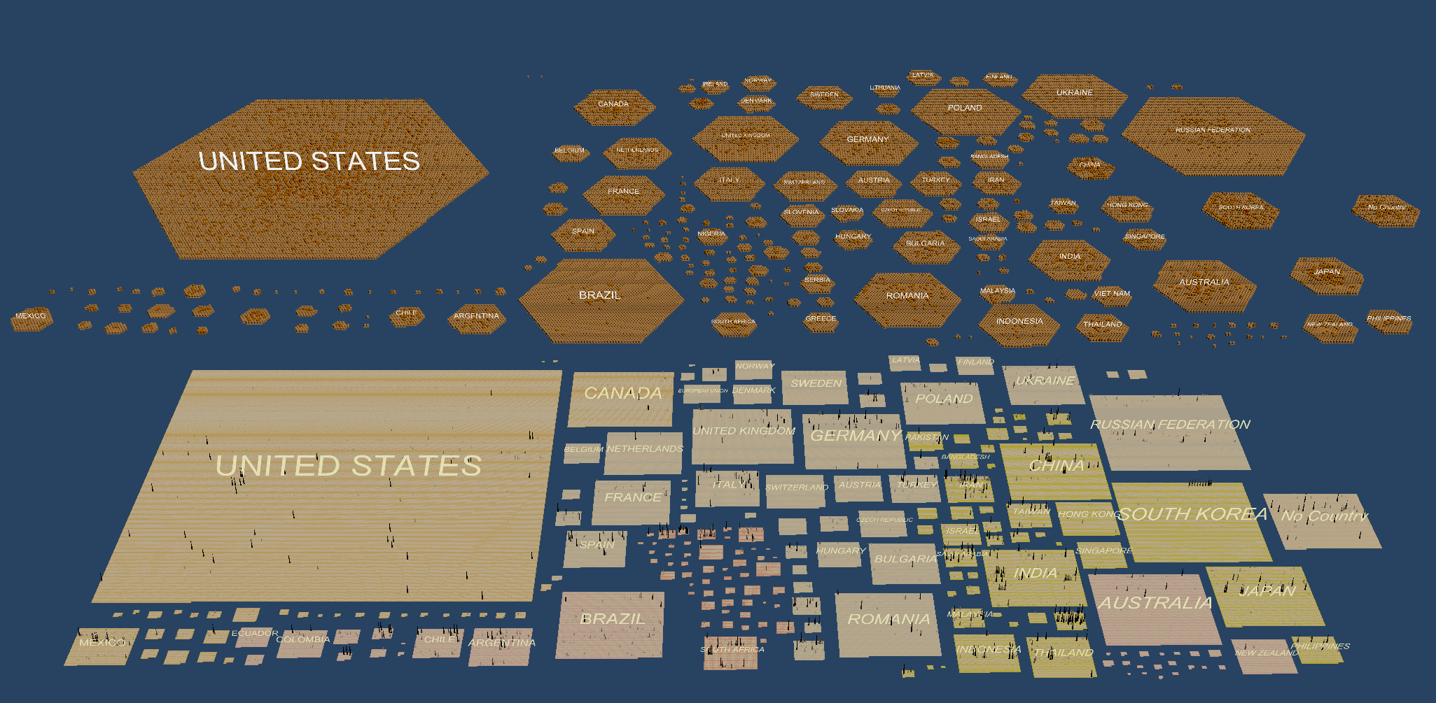
The upper layer represents AS, grouped by their country of registration. Beginning in the center of each hexagon with the lowest numbered AS (theoretically, the oldest), AS spiral out in AS numerical sequence. New AS will be added to the outer rim of the hexagon, allowing the innermost AS to remain relatively consistent and predictable. Each AS is represented by a hexagonal column, whose color and height are determined by the number of netblocks assigned to that AS.
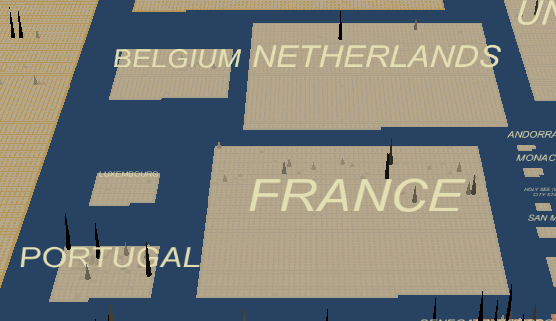
The lower layer represents netblocks as individual square columns. Netblocks are grouped by country of physical location. Locating a netblock "in a country" is a key challenge for this projection, again highlighting an area for further analytical research. Within a country, netblock columns are arrayed in rows ordered by CIDR (Classless Inter-Domain Routing) prefix from lowest to highest. The color and height of each netblock column can be flexibly determined based on specific parameters of interest, such as number of IP addresses or aggregate reputation. For this implementation, netblocks are represented by graduated "reputation spikes" based on the total number of incidents reported by commercial threat intelligence companies for IP addresses within that netblock.
Both layers of this projection are loosely geographic, in the sense that the hexagons and squares are arrayed as closely as possible to Earth's geography (ignoring oceans, but respecting continental membership) while acknowledging that the land area of most countries is not a good representation of their Internet footprint. The resulting country layout is a geography much more relevant to the Internet while wasting considerably less display space. This is most apparent in a top-down view of both layers:
One of the most interesting abilities of this projection is to visually explore the relationships between AS and their component netblocks. Selecting an AS on the top layer will activate lines connecting that AS to all of its component netblocks, immediately showing AS that support netblocks in multiple countries.
Internet map projections could provide a canvas onto which information about Internet entities can be layered and displayed to make the enormous complexity of the Internet more accessible and understandable. A context-rich, cyber-specific, consistent, intuitive, and standardized visualization of the Internet could do for the Internet what Google Earth did for improving people's understanding of, and access to, the physical world. Atlas is a prototype that I hope will elicit feedback and engender discussion about approaches to solving the Internet visualization gap. Send your thoughts to info@sei.cmu.edu.
Written By

More By The Author
Get updates on our latest work.
Sign up to have the latest post sent to your inbox weekly.
Subscribe Get our RSS feedGet updates on our latest work.
Each week, our researchers write about the latest in software engineering, cybersecurity and artificial intelligence. Sign up to get the latest post sent to your inbox the day it's published.
Subscribe Get our RSS feed